Phil Seo
 

The Problem:

Venmo users need a way to give money to causes they care about.

The Solution:

We designed extended functionality for Venmo users to set up fundraising causes within the app, and to broadcast those causes on both a global, and a friends-only scale.


Team: 3 Designers

My Role: UX Designer and User Advocate

Project Length: 2 weeks

Tools Used: Sketch, InVision, Adobe Illustrator


Step 1: Research and Synthesis

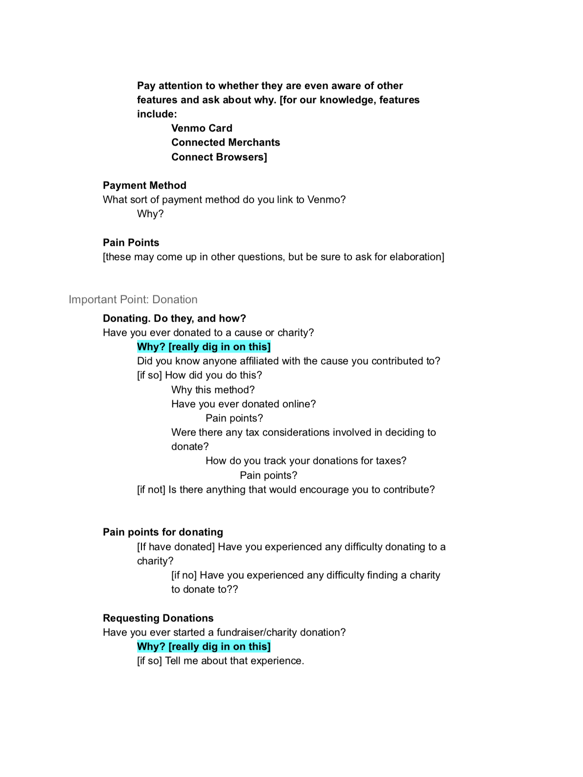
Our first step was to identify the habits of frequent Venmo users and habitual donaters/fundraisers. We created a screener to find people who fit both criteria, and I developed an interview script focused on identifying our target users’ familiarity with Venmo’s features and pain points in donating or raising money.

We conducted a total of 6 user interviews, then converged and created an affinity map to synthesize our insights into “I” statements.

Combined with competitive analysis of other methods of online donation and fundraising, we generated proto-personas.


Key Takeaways:

  • Biggest barrier to donating is convenience

  • People donate for emotional reasons. Either to help friends/acquaintances, or to support causes that hold personal significance.

  • People want to know exactly where their money is going and what it is being used for

  • People donate once for immediate causes (friend needs surgery, etc.), and set up recurring donations for larger causes (St. Jude’s Hospital, etc.)


Step 2: Ideation and Design

Our first step was to identify the key goals our users have in terms of donating to causes. We settled on three main tasks:

  1. Donating to a friend’s personal cause.

  2. Setting up a recurring donation to an organization.

  3. Creating a fundraising cause to request donations.

In order to design most efficiently, we each took one task and designed independently. I took Task 1, donating to a friend’s personal cause. We all agreed to work as much within Venmo’s established navigational schema, to keep our designs copacetic. We followed a model of diverging, designing, then converging to integrate our designs. We continued this approach through initial sketches, to paper prototyping, and eventually medium and high fidelity digital prototypes.


Step 3: Testing and Iteration

As we moved into medium and high fidelity digital prototyping, I designed the new icon to represent our new Causes functionality in the hamburger menu, and a variant of the icon to represent the “Create a Cause” action (See included images).

I chose an outstretched hand offering a heart to reflect our users’ motivations for donating (namely, that they donate for emotional and personal reasons), reasoning that this would help users quickly recognize the nature of the icon.


At this point my team members began to show great interest in refining the visual design of our prototype, so I focused on conducting usability tests and sharing my insights with the team. I conducted a total of 5 usability tests. After each round of testing, I synthesized my findings into actionable changes and shared these with the team.

Most changes were aesthetic, such as changing the wording of text to make things clearer, or even adding actual photos (as opposed to placeholder blanks). These aesthetic changes greatly impacted testers’ ability to smoothly navigate the app.

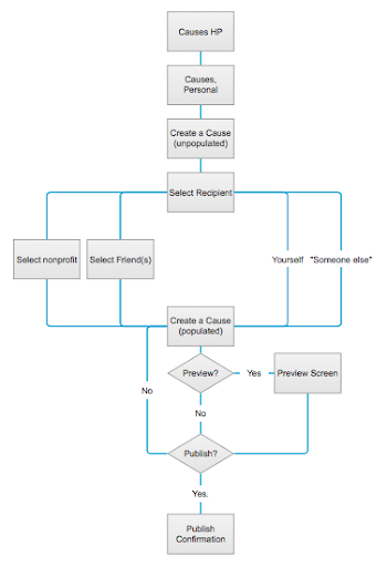
Other changes were more structural, such as allowing users more than one way to accomplish a goal. For instance, some users wanted a call to action to Create a Cause within their Personal Causes feed, while others preferred to tap on the Create a Cause Icon in the top right of the screen. Since users were split on this, we built ways to allow the user to take either path while still achieving their goal.


Next Steps

One issue we didn’t get a chance to address was an overall confusion with Venmo’s navigation. In sticking as closely as possible to Venmo’s established structure, we found that many users did not know what Venmo’s navigation icons meant. Consequently, when we added a separate Causes screen, mirroring the design of Venmo’s Transactions screen, users assumed that the Causes screen had simply taken the place of Venmo’s Global Transactions feed, or assumed that the two screens were essentially one and the same.

Addressing this would require a deeper redesign of Venmo’s established navigational scheme, perhaps even involving introducing more colors to Venmo’s style guide, but would greatly reduce user confusion.


Takeaways

More than anything else, working on Venmo Causes gave me an appreciation for building a strong team plan. Sitting down with my teammates, outlining our strengths, weaknesses, working styles, and establishing guidelines for how we would manage our creative process made the design process collaborative and efficient.

One of the biggest factors was the decision to tackle high-level design questions as a group, but trust individuals to handle the low-level implementation. The decision to trust each other as designers allowed us to bring our different strengths to bear, and resulted in a more complete product.

Additionally, creating a style guide (in this case, sticking to Venmo’s established style) made it possible to generate designs independently, then easily integrate them again, which was key for our decentralized design approach.